
Natalya Hughes: Making sense of images

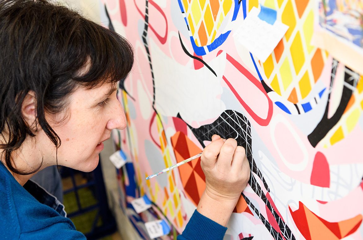
Natalya Hughes in her home studio / Photograph: Chloë
Callistemon © QAGOMA / View full image
An eclectic mix of interests and influences fuels QAGOMA’s second Open Studio artist, whose practice foregrounds the decorative arts while exploring the representation of the female body. Bronwyn Mitchell spoke with Natalya Hughes about her early love of fabric, the paintings of Willem de Kooning and the role of curiosity in the initial stages of an artwork.
Watch | Meet Natalya Hughes
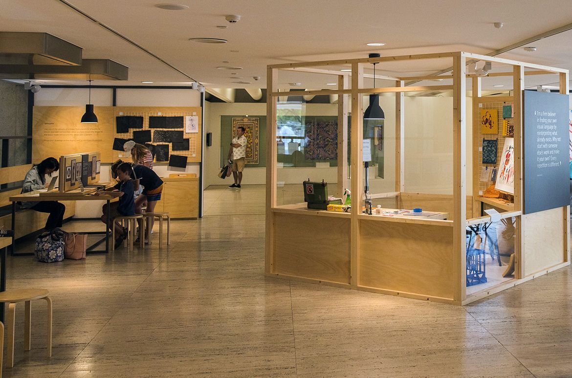
Open Studio at the Queensland Art Gallery is a home for the creative process. Whether you are looking at artworks selected by each guest artist, sitting down to engage in a drawing tutorial at our drawing stations, watching artist interviews, reading artist books or exploring materials and works in progress on loan from the artist’s studio, you are connecting with the skills and ideas that inform a living creative process.
This is a continuation in a series of blogs and videos that explores the artists space. Pick up clues and tips about how the artist experiments, manipulates and refines materials and processes.
Natalya Hughes
In the leafy suburb of Tarragindi in Brisbane’s inner south, Natalya Hughes’s studio is filled with large-scale paintings in progress, vintage fabrics and an enviable bookshelf of art and design tomes. Works of feminist scholarship sit alongside a treasure trove of decorative arts books, including volumes on Japonisme, William Morris and pattern libraries of Italian ceramic tiles.
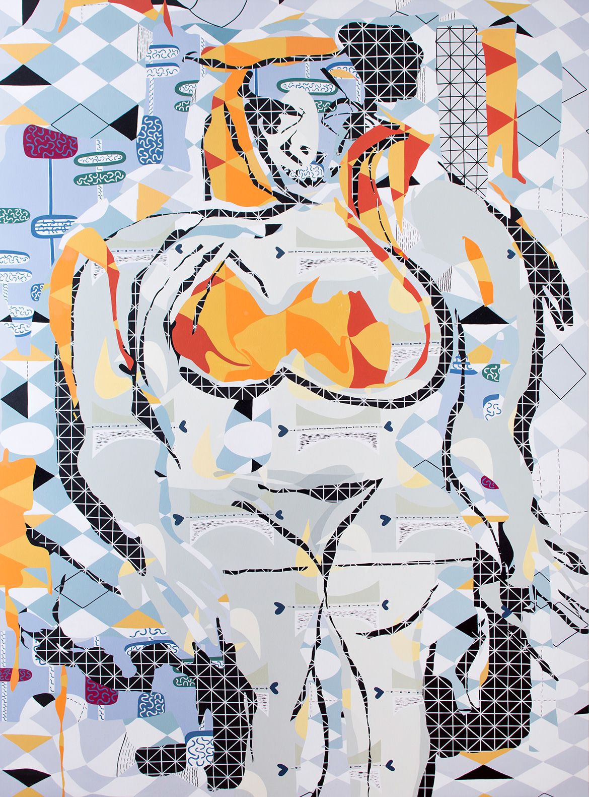
Natalya Hughes ‘Woman III’ 2018–19

Natalya Hughes, Australia b.1977 / Woman III 2018–19 / Synthetic polymer paint on polyester / Courtesy: The artist and Milani Gallery / Photograph: Nicholas Aloisio-Shearer / View full image
‘Historically, decorative art has had quite a negative association in fine art — something that’s feminised as cheap and debased’, says Hughes. ‘But for me it’s a very important part of a language by which I address certain things.’ An interest in decorative form and materials, and in the body, are consistent themes in her practice. Her love of pattern and decoration stems from childhood; encouraged by her mother, she was an avid collector of fabric remnants. ‘As a kid I renovated and decorated the doll house and made new bedspreads for the furniture. Or I was constantly sewing for Barbie.’
Hughes grew up in the small New South Wales town of Macksville, between Coffs Harbour and Kempsey, before moving to Brisbane to study visual art at QUT. Eight years later, she relocated to Sydney to start a PhD and also spent some time in Melbourne. She returned to Brisbane in December 2018 to teach visual art at the Queensland College of Art.
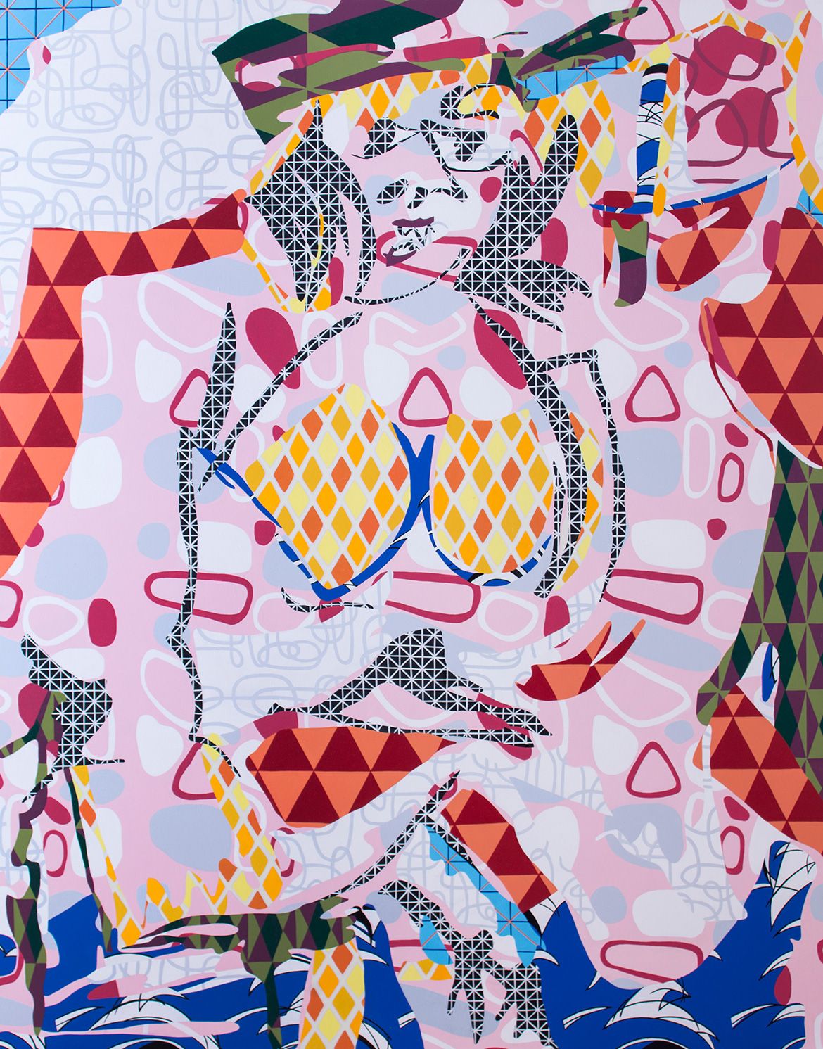
As an academic, Hughes’s artistic practice is part of a broader research career. Many of her paintings begin in response to existing art historical images. She is drawn to the decorative aesthetic — of ukiyo-e (Japanese woodblock prints), the costume designs of Léon Bakst and the drawings of latenineteenth- century English illustrator Aubrey Beardsley, for example — and decoration has become the vehicle by which she moves between the abstract and the figurative. More recent works are influenced by the abstract expressionist paintings of Willem de Kooning and Ernst Ludwig Kirchner, but here Hughes says she was primarily interested in ‘the representation of women’s bodies as a site of experimentation’.
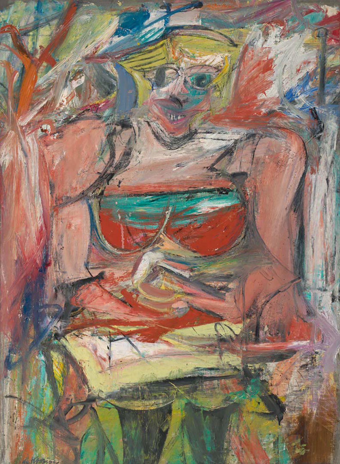
Willem de Kooning ‘Woman V’ 1952–53

Willem de Kooning, The Netherlands/United States 1904–97 / Woman V 1952–53 / Oil and charcoal on canvas / 154.5 x 114.5cm / Purchased 1974 / Collection: National Gallery of Australia, Canberra / © The Willem de Kooning Foundation, New York/ARS/Copyright Agency, 2019 / View full image
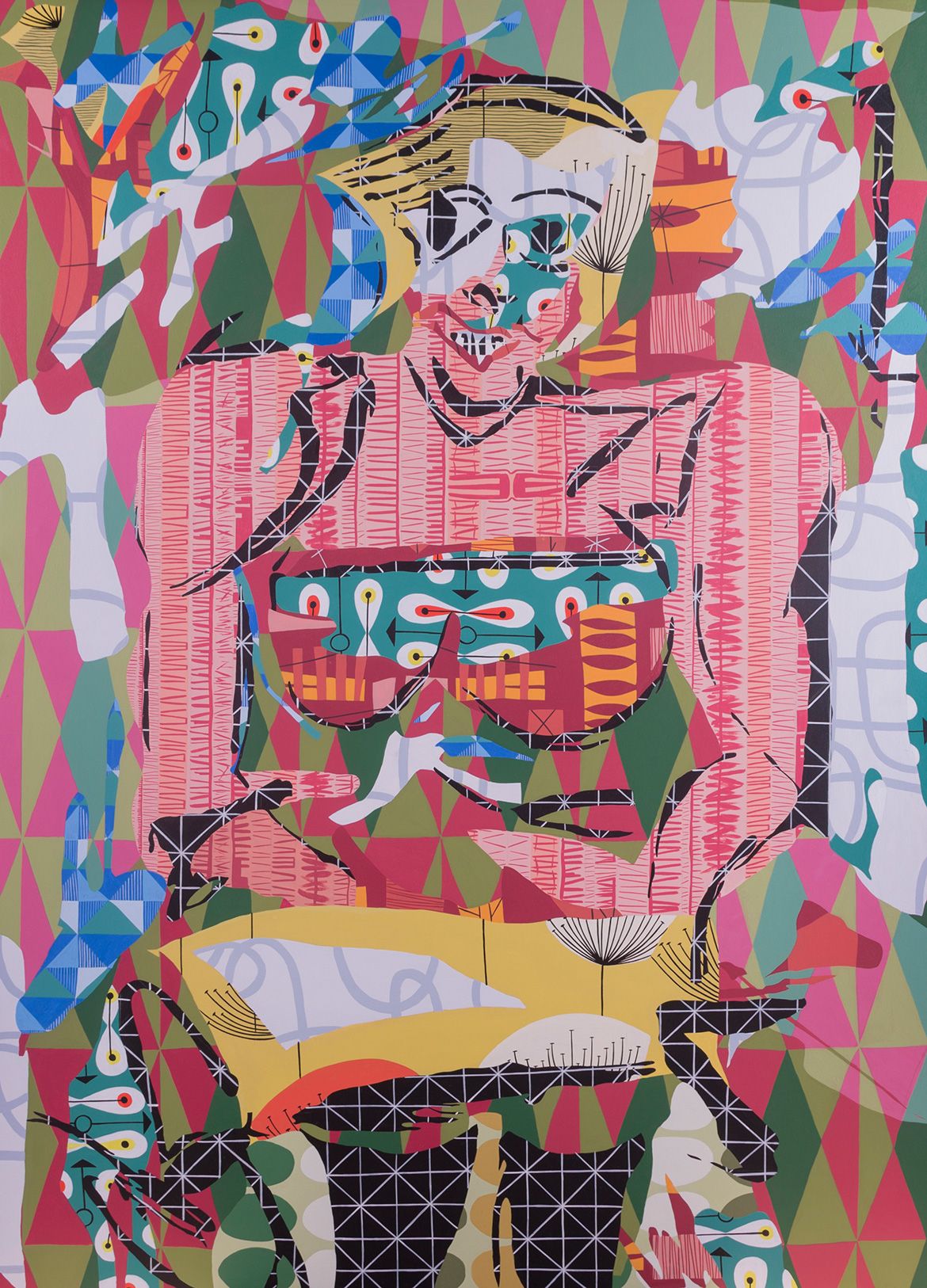
Natalya Hughes ‘Woman V’ 2018–19

Natalya Hughes, Australia b.1977 / Woman V 2018–19 / Synthetic polymer paint on polyester / Courtesy: The artist and Milani Gallery / Photograph: Nicholas Aloisio-Shearer / View full image
‘I was never enthralled by that thick, expressionist painting style in the same way that other people seem to be; I’ve always been a very flat, neat painter’, she says. ‘I was drawn to [de Kooning and Kirchner] not because they have a decorative aesthetic . . . [but] because I wondered what would happen if I brought that aesthetic to [the same subject]. Those artists would be loath to have me do that, I’m sure’, she adds. ‘“Decorative” was probably flung around as an insult in de Kooning’s time.’
Across her practice, Hughes is interested in the language by which she negotiates a particular, less celebrated, feminine body — one that is difficult, marginalised or in some way grotesque. She brings her own unique and decorative language to her ‘Woman’ series, which echoes de Kooning’s landmark series of the same name, and she is both intrigued and bothered by the way de Kooning sometimes spoke about the women in his paintings. ‘Lots of people are apologetic for him, but he’d say things like “I like to put it at the centre”. What is it?’ she asks.
I was teaching photography in Sydney, and students consistently presented truncated images of women, usually naked, no arms, no head, black and white, high contrast, sort of Edward Weston-ish. And I’d say, ‘Well, what’s it about?’ ‘The female form’, they would respond, and I’d say, ‘Which female?’
Hughes would continue to interrogate her students’ decision to use specific female bodies (generally young, athletic and white) with which to explore form. ‘I think it comes from certain modernist practices and I find it incredibly problematic. I wanted to respond to that in my work by exploring some of these questions. What is this female form you keep talking about? And actual human women, where do they fit?’
It is obvious that Hughes is driven by questions, and her works are thoughtful and considered attempts at answering them. Many of her previous works grew out of what she describes as a sticking point. ‘I don’t feel inspiration is the thing that prompts me’, she says.
Rather, I get curious about something and think, I really must sort that out. So then I read about it, and there’s a lot of iteration and development of an idea before I start the work. I want to understand something, and I do that by taking it apart and trying to re-articulate it. That’s just how I make sense of images.
Hughes admits to being obsessive with a certain level of detail and precision in her paintings. The works she is least happy with are those in which she decided to pare back the decorative elements — ‘There’s nothing like a deadline to make me stop!’ — but if paintings come back to the studio after an exhibition, she often over-paints or continues adding pattern. ‘I’m not good at letting go when it comes to finishing work. A phrase that kept coming up when I was doing my PhD was horror vacui, the fear of blank space. I think that might be me. I end up covering things.’
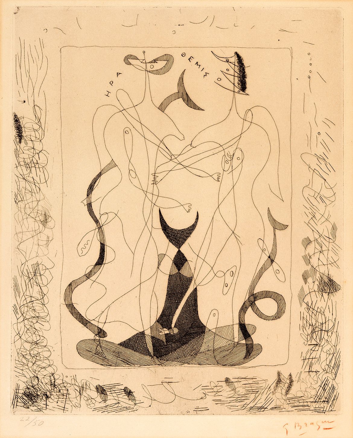
Georges Braque ‘Hera and Themis’ 1932

Georges Braque, France 1882-1963 / Hera and Themis 1932 / Etching on light brown wove handmade paper / 36.7 x 30cm (plate) / Gift of Mrs Lillian Bosch 1972 / Collection: Queensland Art Gallery | Gallery of Modern Art / © Georges Braque/ADAGP, Paris. Licensed by Viscopy / View full image
In 1931, Ambroise Vollard invited Georges Braque to illustrate a book of his choice. Braque selected Hesiod’s Theogony, an epic poem composed around 700 BCE that describes the creation of the universe and the genealogy of the Greek gods The sixteen etchings he produced for the publication between 1932 and 1935 show his preference for female figure.Braque’s drawings were inspired by the incised linear figures and geometric patterning found on archaic Greek and Etruscan ceramics and bronzes. However, his use of an arabesque line also shows the influence of the automatic drawing of the Surrealists.
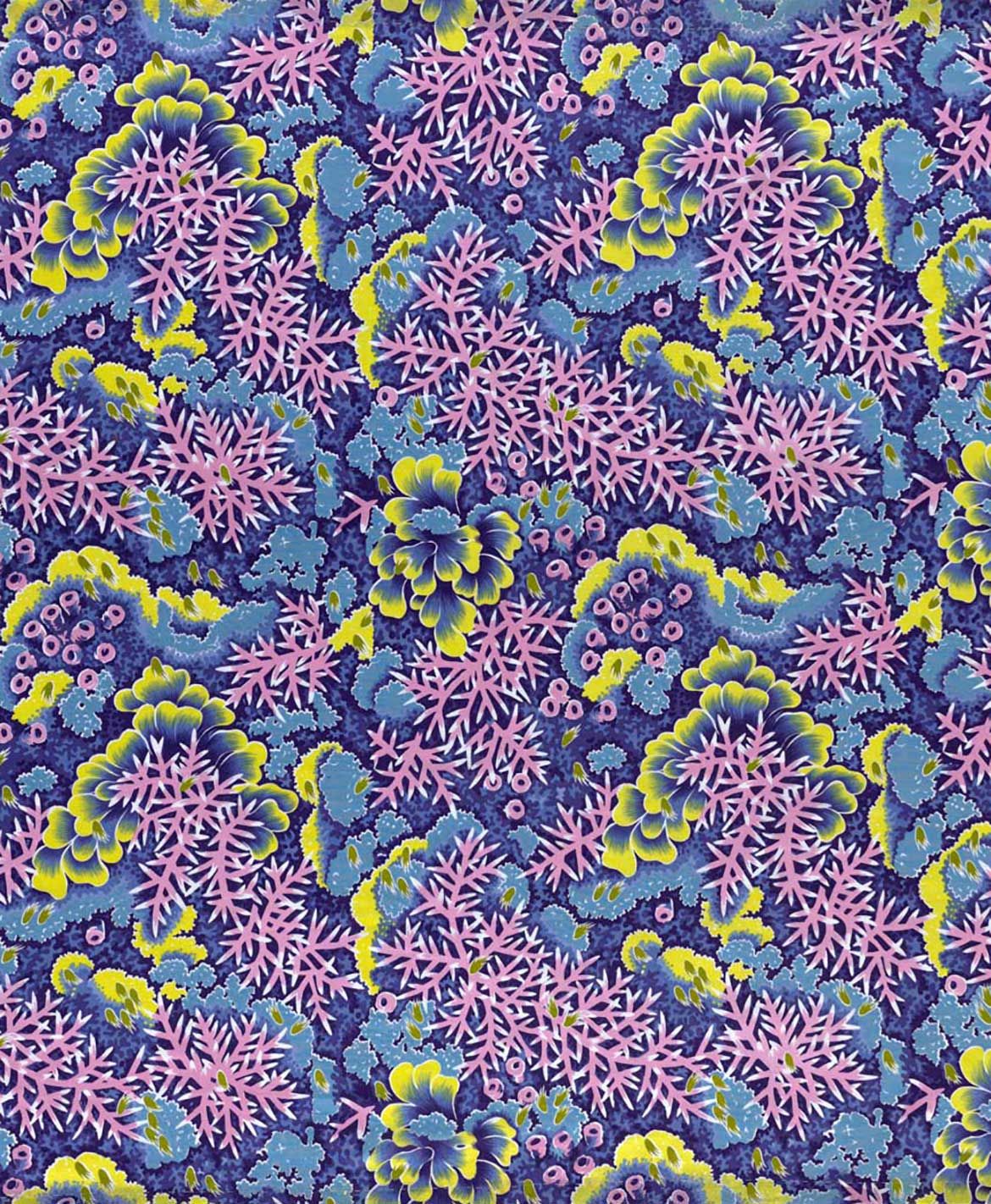
Olive Ashworth ‘Textile length: Coral garden’ c.1956

Olive Ashworth, Australia 1915-2000 / Textile length: Coral garden c.1956, printed 1971 / Commercially printed cotton cloth / Purchased 1996. Queensland Art Gallery Foundation / Collection: Queensland Art Gallery / © The artist / View full image
Olive Ashworth is one of the few Australians, and the only Queensland-based artist, to contribute significantly to textile design in the mid twentieth century. Ashworth dedicated much time to studying the Great Barrier Reef from an underwater viewing observatory, producing pencil, gouache and watercolour sketches of the sublime displays of coral, shells and fish. These sketches were reproduced in tourist brochures, and carefully repeated as patterned prints for textiles. Although influenced by graphic styles and high-key colour palettes of the time, her early work was quite faithful to what she observed on the reef. Her later work became more stylised, perhaps in keeping with Australia’s kitsch sensibility of the 1970s and 80s.
In addition to running workshops and artist activations in the Open Studio space, Hughes has also curated a selection of works from the QAGOMA Collection that reflect her interests in the decorative arts and the female body, including ceramics by First Nations artists in New Mexico and Central Australia, etchings by Georges Braque and Kara Walker and a textile length by Queensland designer Olive Ashworth.
It’s been interesting to cut to the core of what my practice is and to tease out how my studio activities might function in the space. Because you can’t include everything. Like lots of artists, I do different things at different moments — things like emailing are a big part of being an artist, and there’s all kinds of studio ephemera that I knew wouldn’t be making its way into an open studio.


Visit Open Studio for insights into the creative practice of Natalya Hughes / View full image
Hughes often listens to art or comedy podcasts while she works, in between music and audiobooks. At the time of our conversation she’s part way through Anna Karenina, read by Maggie Gyllenhaal — ‘just the most beautiful audiobook!’
Podcasts and literature are helpful [to avoid] getting stuck in a particular mood, which I think is a bit of a studio habit. And, to be honest, much about painting is boring for me, like laying down flat colours — I might as well be painting a fence paling, which is when my assistant is amazing. I like to come back at the end, to have a say in all of it and make the initial image, but there are parts of the process where I just don’t think I need to be there. I’m very sceptical of this way of thinking about art where the artist emotes their very being into the paint — why not outsource parts of it?
Hughes says she acutely remembers the headspace she was in while making each painting, however, recalling particular houses or partners, for example, or the period of time after her father died. ‘I spend hours and hours with these things, so I don’t think it’s a matter of my emotions being translated into the work and the audience being at the receiving end of it, but, for me, they mark time — they mark moments in my life just because of the amount of artistic labour.’
Natalya Hughes ‘Woman IV’ 2018–19

Natalya Hughes, Australia b.1977 / Woman IV 2018–19 / Synthetic polymer paint on polyester / Courtesy: The artist and Milani Gallery / View full image
Musing on what might come next in her practice, Hughes thinks she’s not yet finished with exploring de Kooning’s nudes and is considering an installation element of the current project that would incorporate a mid-twentieth-century painting aesthetic with vintage textiles and furniture.
I have this image of part installation, part painting show, part 1950s sleek designed bachelor pad. I’m thinking through ways that I might realise that, spatially and with sculpture, and I’m finding that really exciting, especially the idea of making furniture again.’[1]
It would be hard to imagine a more fitting confluence of Hughes’s diverse interests — may it come to fruition in the near future.
Bronwyn Mitchell is former Assistant Editor, QAGOMA. She spoke with Natalya Hughes in September 2019.
Natalya Hughes’s series of paintings responding to Willem de Kooning’s ‘Woman’ series is supported by the Australia Council’s Arts Project funding program.
The Female Form
Opposing Elements
The Silhouette
Decorative patterns
Ideas to painting
Making Patterns
The Artist studio
The Audience
Featured image: Natalya Hughes in her home studio painting Woman IV 2018–19 / Photograph: C Callistemon
Endnotes
- ^ Natalya Hughes’s The After Party 2012, consisting of an upholstered dining suite, wallpaper and carpet squares, was displayed at GOMA in 2012 during ‘Contemporary Australia: Women’ and generously gifted to the Gallery by the artist in 2019.