
Visual Storytelling: Designing for European Masterpieces

Have you ever wondered what goes on behind-the-scenes when designing for a major exhibition ― specifically ‘European Masterpieces from The Metropolitan Museum of Art, New York’ at the Gallery of Modern Art.
Every exhibition starts with the artwork ― in this case 65 superb paintings spanning 500 years ― that offer a breath-taking journey from the 1420s and the emerging Renaissance to conclude at the height of early twentieth century post-impressionism in the 1920s.
LIST OF WORKS: Discover all the artworks
DELVE DEEPER: More about the artists and exhibition
THE STUDIO: Artworks come to life
WATCH: The Met Curators highlight their favourite works’
Visual storytelling
Designing an exhibition at QAGOMA is a multidisciplinary process that combines staff from many departments with a variety of skills, such as curation, exhibition design, graphic design, web and motion graphics, workshop, registration and conservation teams, the installation crew, and finally lighting, all coming together where collaboration is the key to success.
Visual storytelling underpins the display to create a meaningful and memorable experience for our audience. The challenge with ‘European Masterpieces’ was to display works over 500 years, moving smoothly through art movements from the fifteenth to twentieth centuries. The starting point for an overall design strategy was the GOMA building itself, enabling the design team to take a contemporary approach in contrast to the historic setting where the artworks are on permanent display in their home at The Metropolitan Museum of Art.
The aim was to source and profile an architectural motif consistent over 500 years that could be applied both in an historical application yet with a modern twist. The arch offered such an opportunity to be adapted to accommodate the three distinct exhibition themes to create an unforgettable journey through the history of European art.
Among a variety of design strategies to create an exhibition, exhibition designers combine a range of colour and intensity, a variety of materials and decoration, the construction of physical and visual pathways including transition zones, and ambient lighting to create just the right mood. The arch and its variations was accompanied with a carefully considered changing colour palette for each theme transitioning from dark to light and similarly with lighting tones.
The arch ― in part inspired by The Metropolitan Museum of Art’s architecture, and historical prompts from the artworks themselves ― is repeated with subtle differences throughout the three chapter themes ‘Devotion and Renaissance’, ‘Absolutism and Enlightenment’, and finally ‘Revolution and Art for the People’.

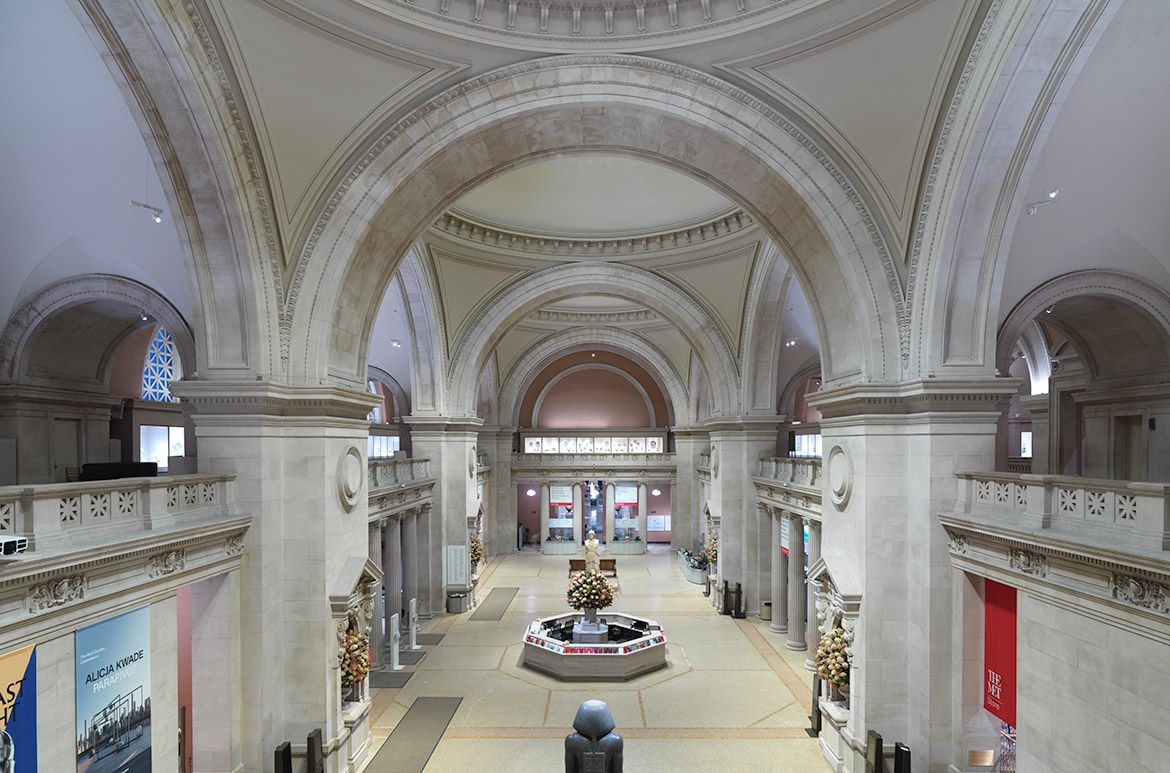
The Metropolitan Museum of Art’s Great Hall / © The Metropolitan Museum of Art, New York / View full image
The arch: Variations of scale, form and detail
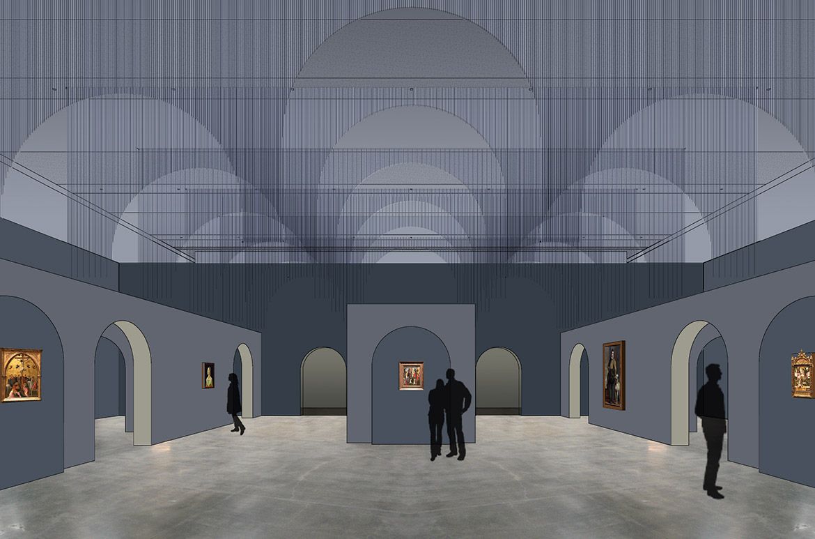
The chapter themes have been used to divide the exhibition into three main curatorial groupings, and the arch, varying in scale and detail was a recurring design element throughout these different time periods ― Renaissance, Baroque and ending with the Modern. This connecting architectural element throughout these themes reduces in scale as you progress through time, playing with form to give prompts to the artistic period on display.
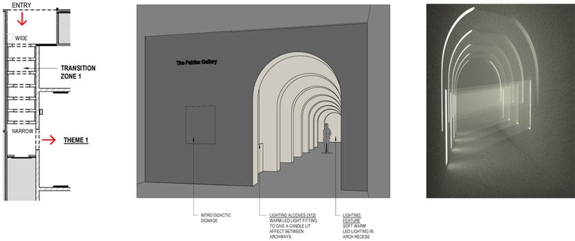
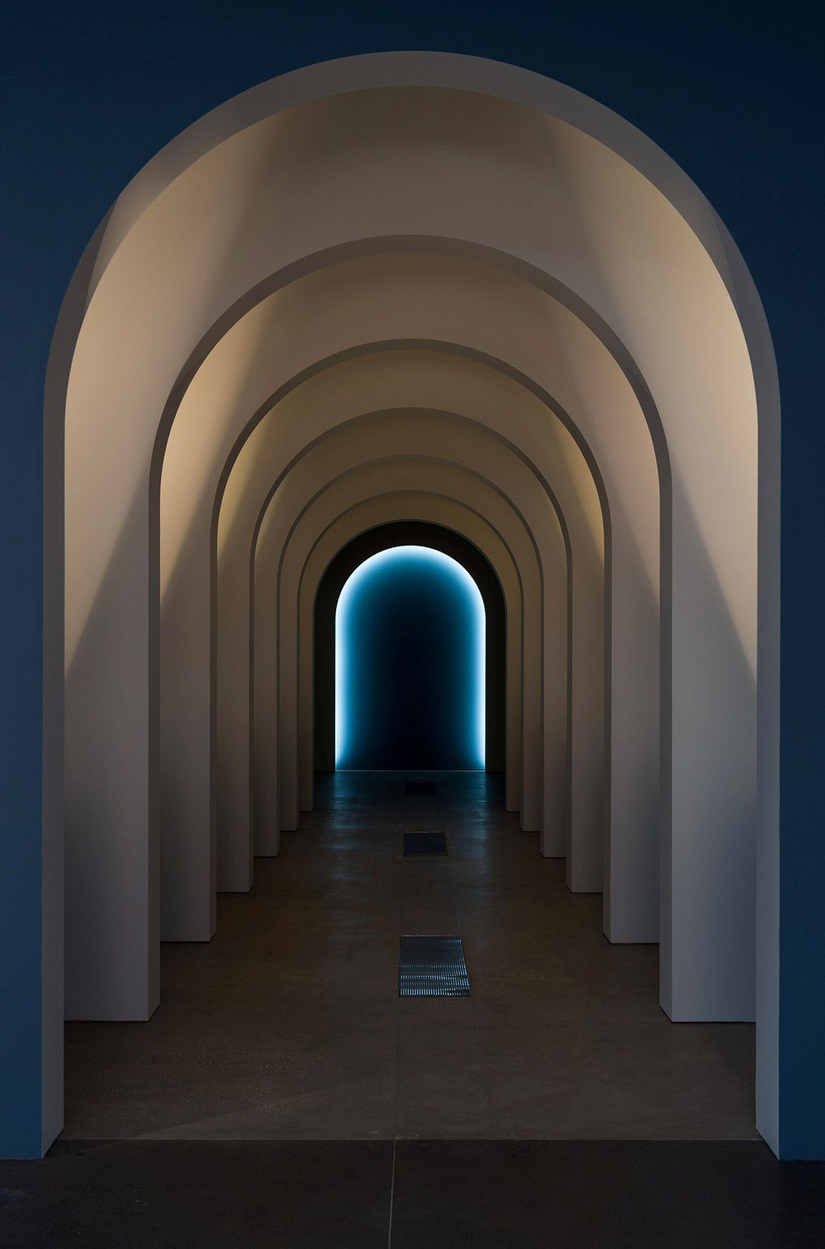
Exhibition entrance
Adopting the forced perspective techniques used in Renaissance architecture, a series of repeated arches decreasing in size and spacing, and a contemporary response to ‘candlelit’ alcoves, greet you at the exhibition entrance. An anteroom at the end of the corridor creates a moment to pause before entering the exhibition.

Design concept for the exhibition entrance / View full image


The exhibition entrance to ‘European Masterpieces’ / Photographs: Natasha Harth and Chloe Callistemon © QAGOMA / View full image
Devotion and Renaissance
Light levels start low and focused within ‘Devotion and Renaissance’ to become brighter as you navigate the exhibition. Combined with low height walls, colours of cool blue-grey and cool grey are complemented with warm ambient lighting. A light sandstone grey is used to accent the inside of the arch, a contrast against the cool walls.
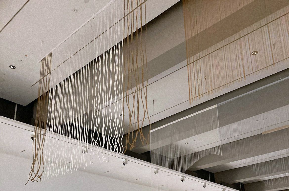
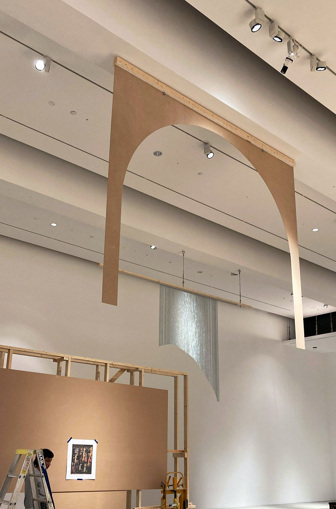
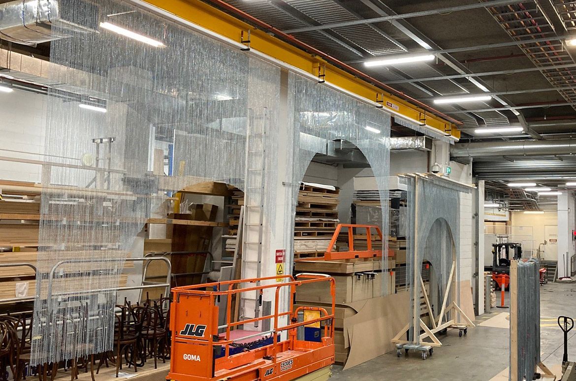
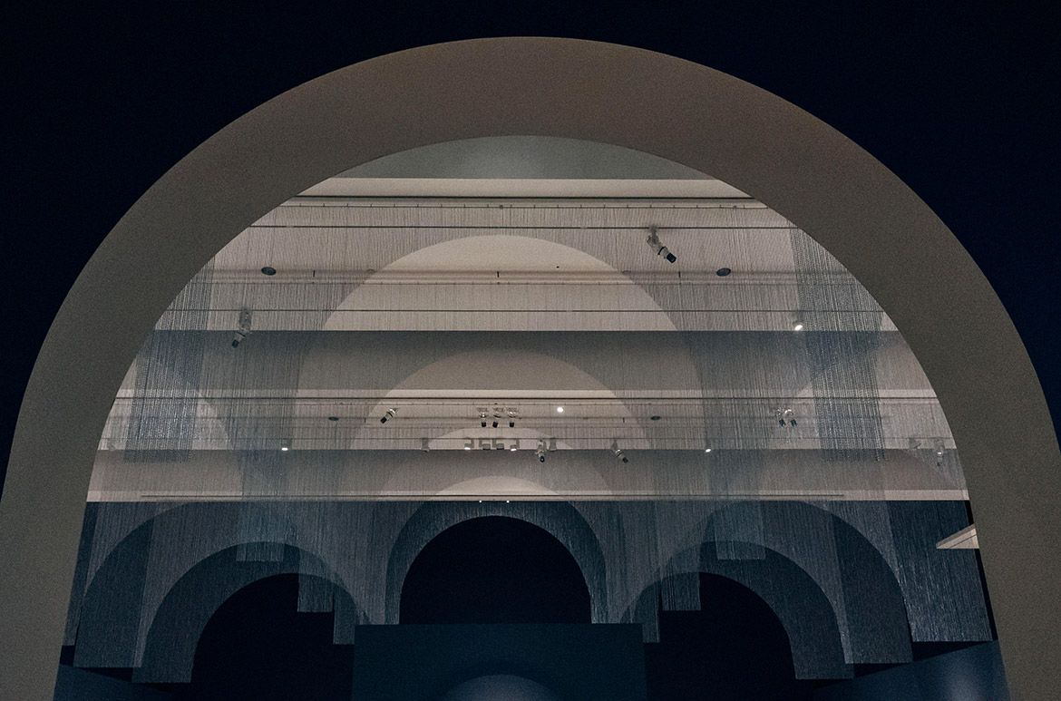
A single jack-chain curtain is the decorative feature overhead, with arched cut-outs it suspends to help create a solemn space for contemplation, reflecting the past grandeur of the church. To achieve the desired effect for the overhead highlight, both exhibition design and workshop went through an extensive testing and prototyping process, ruling out string, rope, plastic, and opting for a custom metal chain curtain pre-fabricated by the workshop team.
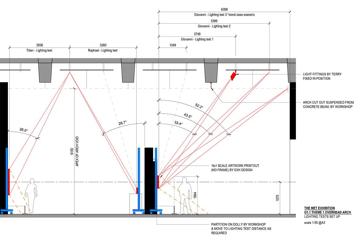
Once the suspend arch feature was confirmed, arch openings were scaled and positioned to consider the placement of lighting tracks in relation to the position of artworks to ensure that the chain curtains wouldn’t cast shadows on artworks.

Devotion and Renaissance / View full image

Testing string, rope, plastic, and metal chain for the curtain feature in ‘Devotion and Renaissance’ / View full image

Testing the lighting track to position artworks / View full image

Testing the lighting track to position artworks / View full image

The chain curtain featured in ‘Devotion and Renaissance’ being prefabricated in Workshop / View full image

Construction of ‘Devotion and Renaissance’, the first chapter theme in ‘European Masterpieces’ / Photograph: Lee Wilkes © QAGOMA / View full image
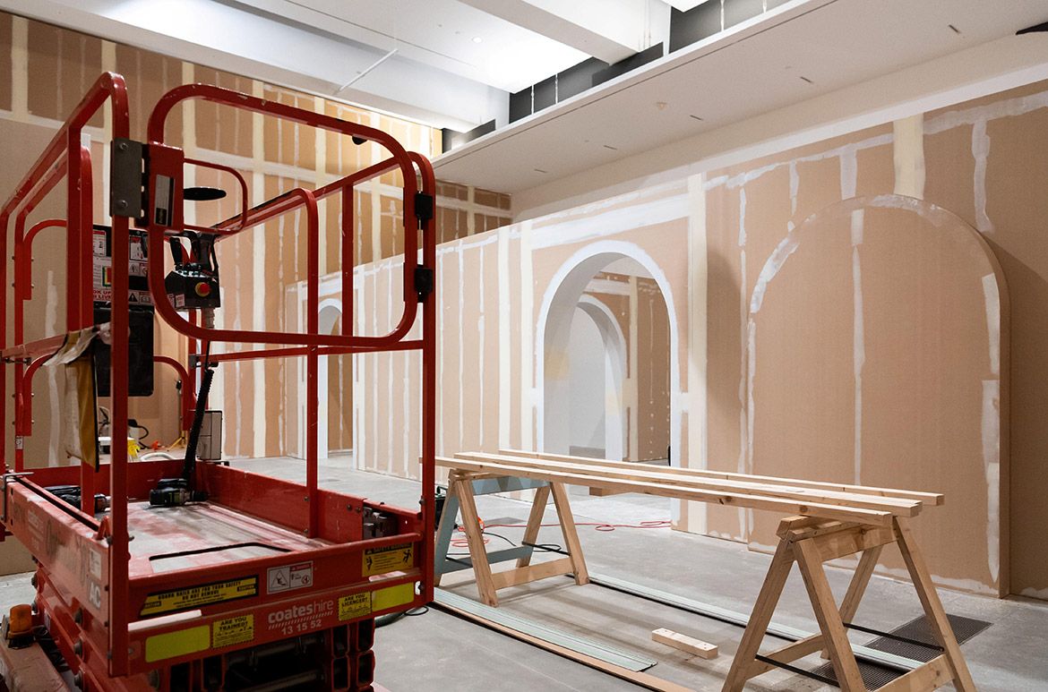


Photographs: Joe Ruckli and Lee Wilkes © QAGOMA / View full image
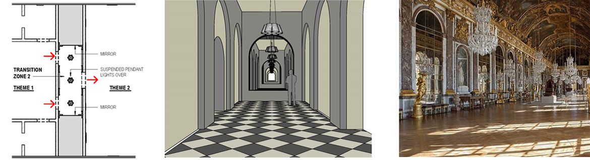
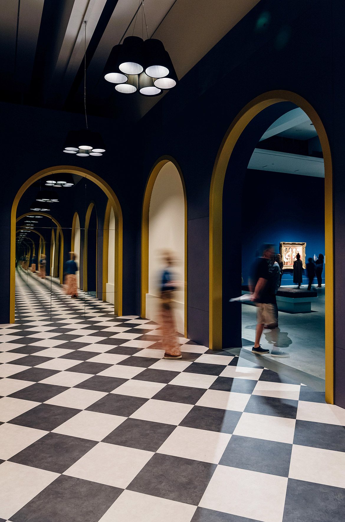
Transition zone
The transition zone between ‘Devotion and Renaissance’ and ‘Absolutism and Enlightenment’ of suspended pendant lighting, mirrors, checkered flooring, and archways placed within an elongated hallway sets the scene for what is to come next, allowing the visitor to pause before they encounter the next change of colour palette, an increase in the wall scale and a change to the arch form.

Design concept for the transition zone / View full image

The transition zone between ‘Devotion and Renaissance’ and ‘Absolutism and Enlightenment’ / Photograph: Joe Ruckli © QAGOMA / View full image
Absolutism and Enlightenment
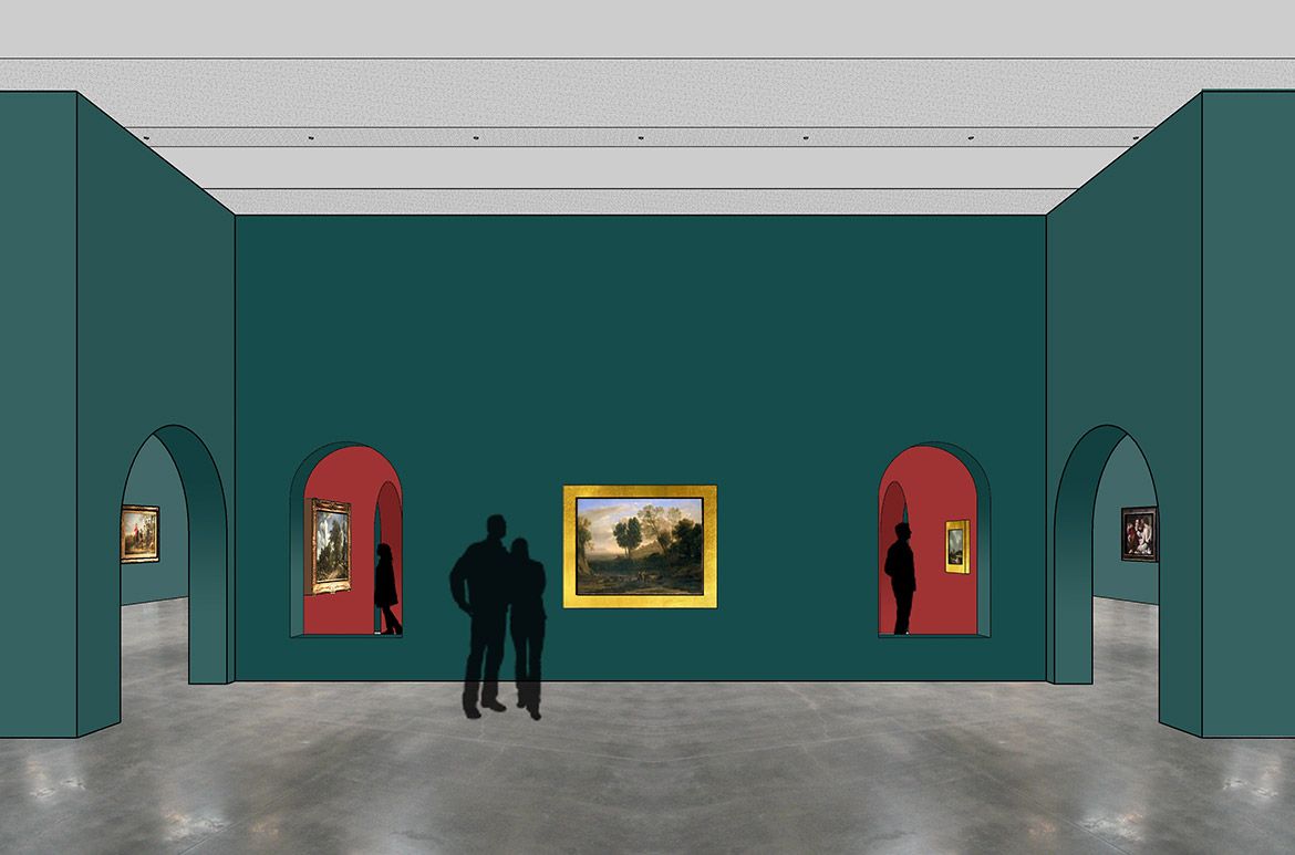
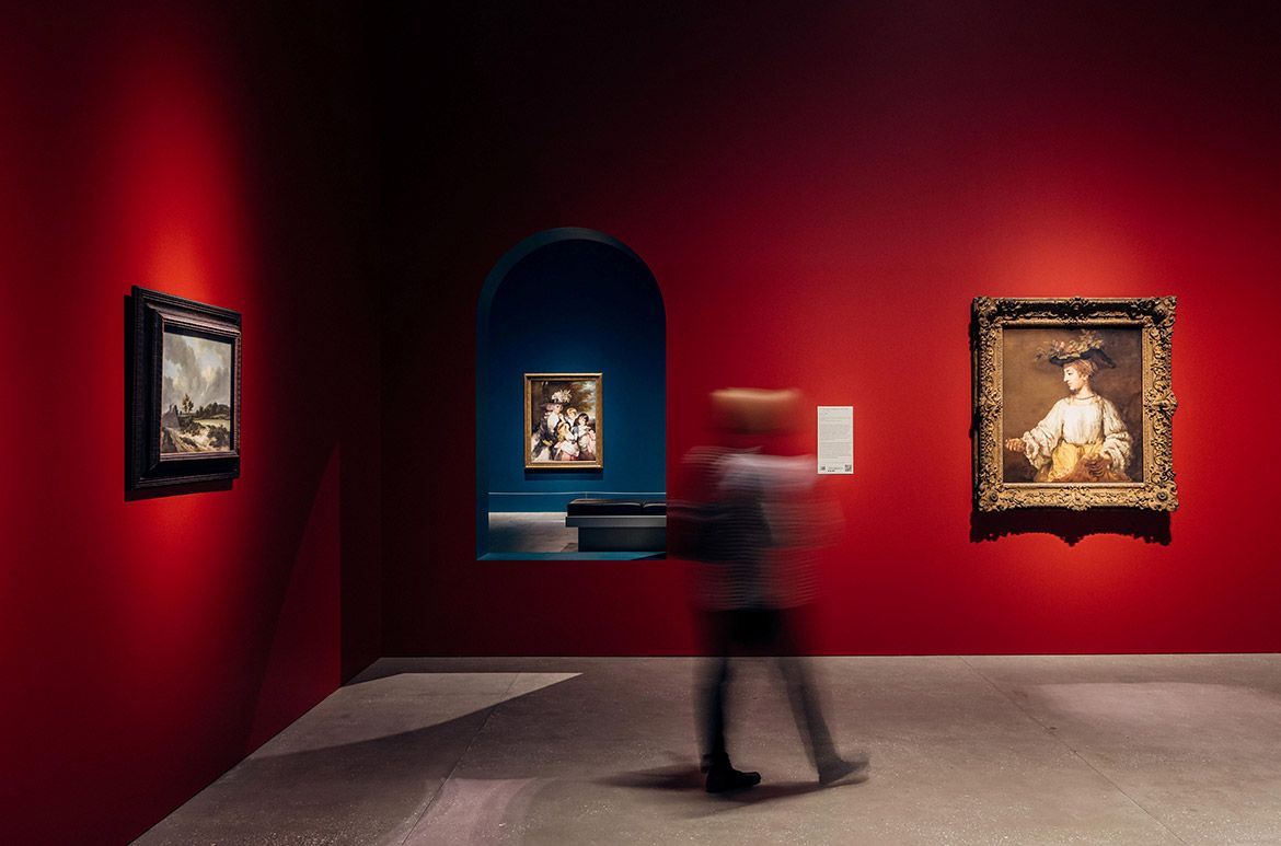
Colour was introduced in ‘Absolutism and Enlightenment’ for dramatic appeal, creating a rich and vibrant luxury with the deeper wall hues, to give the second chapter a burst of drama through a bolder colour palette. Walls of crimson-red compliment the rich gold ornate frames and draws on the tones found in several of the artworks, a deep teal-green was used as an accent to contrast with the red and build on the exhibition palette.

Absolutism and Enlightenment / View full image


The second chapter theme ‘Absolutism and Enlightenment’ / Photographs: Joe Ruckli © QAGOMA / View full image
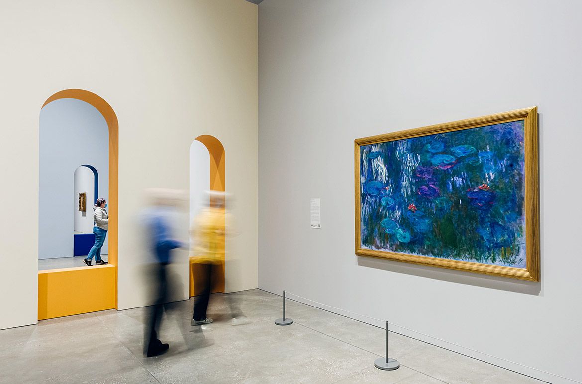
Revolution and Art for the People
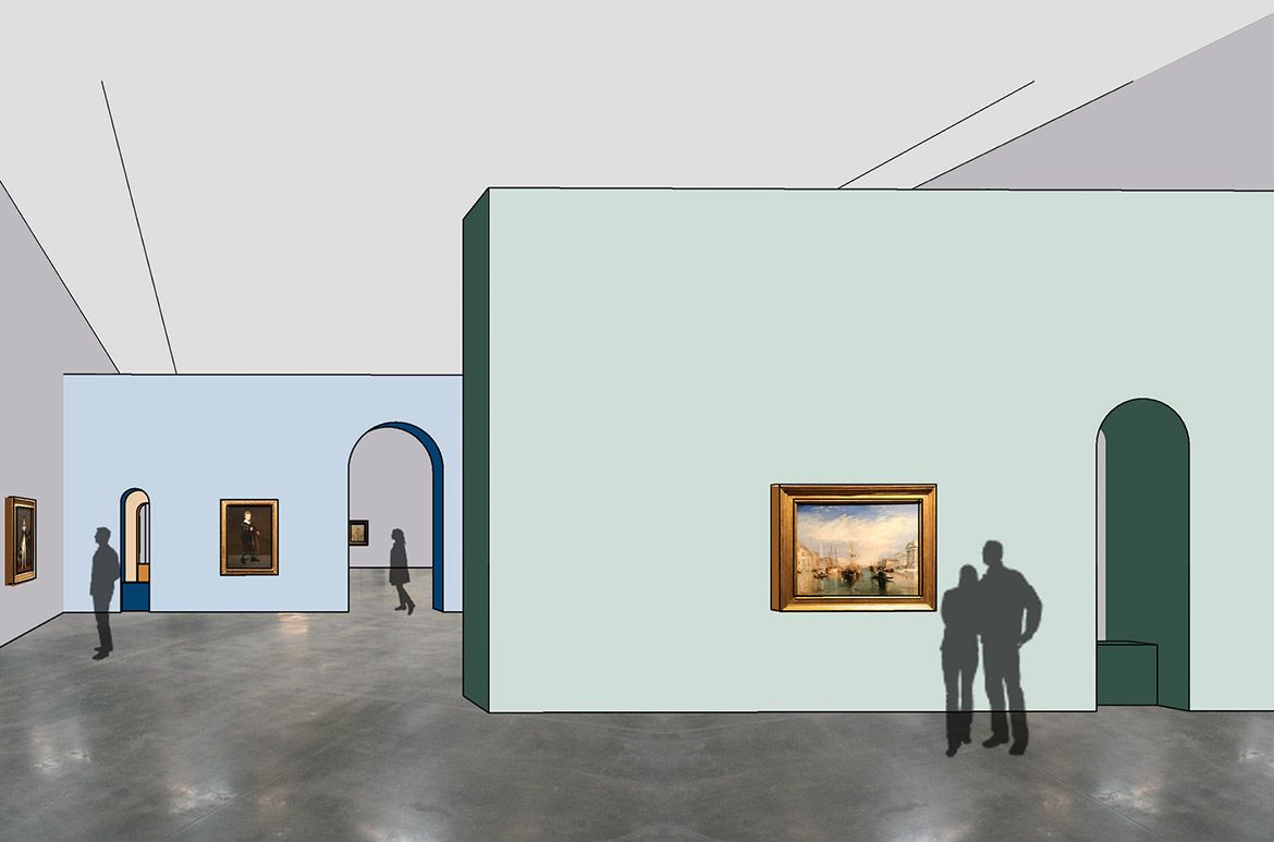
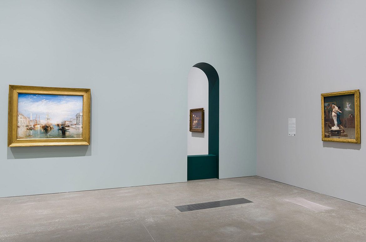
The last exhibition chapter theme ‘Revolution and Art for the People’ had a playful approach to the arch, interspersed in the meandering pathways. The light pastel palette layered on the walls as a base colour of soft grey, plus the spearmint and fresh light blue provided a foil for the bright bold matching tones inside of the arch of deep green and deep blue. The mix of pastel and bolder accents throughout the space created visual interest and movement, with the addition of pale and deep ochre as a contract against the cooler tones to complete the exhibition palette.
These key exhibition design elements transition us from Renaissance altarpieces and chapels of the fifteenth and sixteenth centuries when Christian traditions of devotion underscored one of the most dynamic periods of creative and intellectual growth in human history, through to the Italian Baroque, Dutch Golden Age, French Rococo and Neoclassical movements, to end with the emergence of the Modern era, when the radical notion of the creatively independent artist took hold.
Elliott Murray, Senior Digital Marketing Officer, QAGOMA spoke with Grace Liu, QAGOMA Exhibition Designer and lead designer on ‘European Masterpieces’

Revolution and Art for the People / View full image

Absolutism and Enlightenment, the final chapter of ‘European Masterpieces’ / View full image

‘Revolution and Art for the People’, the final chapter of ‘European Masterpieces’ / Photographs: Natasha Harth © QAGOMA / View full image
This Australian-exclusive exhibition was at the Gallery of Modern Art from 12 June until 17 October 2021 and organised by The Metropolitan Museum of Art, New York, in collaboration with the Queensland Art Gallery | Gallery of Modern Art and Art Exhibitions Australia.